Proposition: The United States is being "ripped off" in trade by China
FOR the Proposition
Design Decisions and Rationale:
- Score: -1
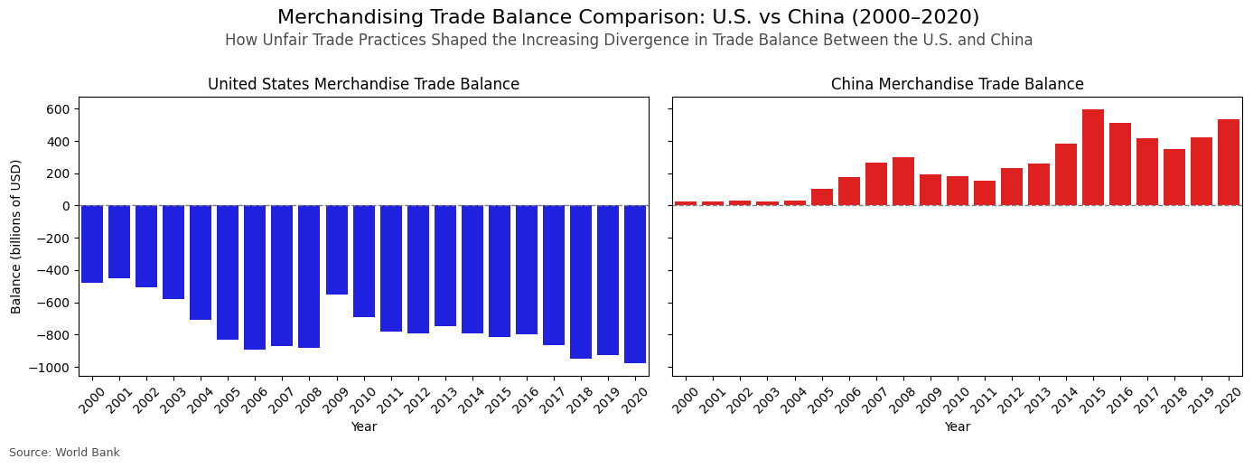
- I chose to visualize only the merchandising trade balance and excluded any exports and imports to simplify the message: the US is being "ripped off" by China. This narrative is very popular now since the appointment of President Trump.
- While balance is a legitimate metric, this chart is very one-sided. In economics we learn that more mature economies move towards a service economy, due to the increased education and labor wages. This is one of the reasons why this chart is highly deceptive.
- Another reason why this chart is misleading is due to the fact that it seems highly disadvantageous to have a trade imbalance. However, the graph doesn't take into consideration WHY this trade imbalance happened: e.g. cheap goods for both companies and consumers. Think about iPhones
- I believe the chart really makes you think: wow is it this bad? Not only is there the opposing difference of the two balances, but the US has a HUGE trade imbalance in merchandising. This makes the visualization persuasive in that the US is being "ripped off".
- I considered showing the graph as the chart below, but I believed it wasn't really desceptive, since it shows a more balanced view of the US in trade. I also thought about a stacked area chart, but that one was too deceptive, as it would make it seem the total imports were imports+exports, making it even worse.
AGAINST the Proposition
Design Decisions and Rationale:
- Score: 1.5
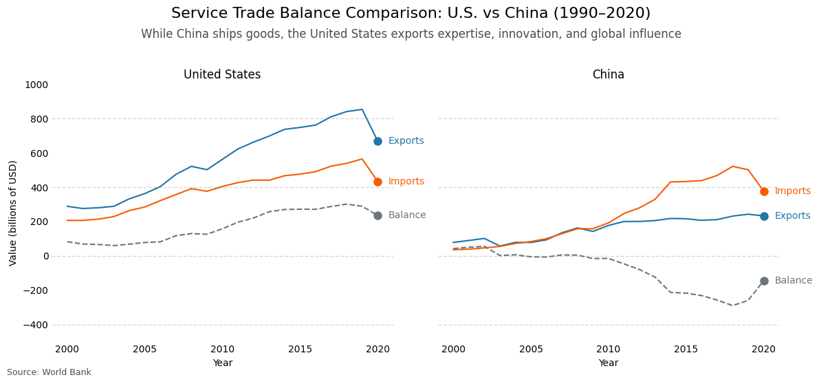
- One important thing to consider when graphing trade is to take economic nuance into consideration. The US is considered a developed nation, which puts a lot of emphasis on education and further development of a social system, such as minimum wages and fairness. In that sense, I wanted to show why the US is actually thriving compared to China in the aspect it's specialized in. That is why this graph reframes the US not as being "ripped off", but as succeeding in high-value service exports like softwarem finance, and consulting.
- The chart makes it clear that the US has a consistent growing surplus in services, whereas China now runs the deficit. It suggests that modern economic power isn't just about goods, but also about global influence, innovation, and expertise.
- I think the chart would be a bit more honest if we saw the total of merchandising exports, as merchandising is way bigger in dollar terms than serviecs. However, this chart is very transparant in that we can see how the balances are composed. If we just saw the balances, it would be misleading because the total amount of imports and exports matter too to show the size of economies.
- I was thinking about different types of charts when considering how to plot the information. However, after doing some Google searches, I found that a lot of news sites use line charts to showcase longer term trends. This is why I chose this particular plot
- I think it's a persuasive plot, as it does clearly show that it isn't just about goods, but about expertise and that the US is leader in this. It also makes it clear how the countries differ in particular components, such as exports.
Final Reflection
This project was a bit more challenging for me than the other one. A week ago I want to Professor Lau to ask how we could find good ideas for charts, as I just wasn't sure how to go about this. His great advice was to research news sites, maybe look at left-winged and right-winged news outlets. This was great, as it actually helped me understand their vocabulary and view. With this information, I wrote out a proposition and got to work on data retrieval.
I chose to do trade, as it is a really big topic right now under the Trump administration. Almost every day we hear something about tariffs, so I thought trade between the US and China (as they got over 100% in tariffs) would be an interesting challenge. With my knowledge of economy, I went digging into the trade datasets. I eventually chose to do merchandising vs services, as my Indian Economy professor once told me that more developed nations eventually pivot into the services sector. There are 4 sectors of the economy: primary, secondary, tertiary, and the quaternary sector. Primary is resources and secondary is manufacturing. China in a lot of cases resemble those two sectors, as they are really big on mining and manfucaturing. The US, however, is more focused on the latter 2, teriary being services and quaternary being IT and research. This distinction is super important when plotting. I made several plots in the end to explore the datasets. See how the data would respond in different timeframes, plotting types, etc. I chose to do since 2000, as everything before can't be properly seen due to the ever expanding size of trade and economies in dollars.
I was heavily surpised by the fact that China is actually running a deficit on services. I knew the US was way stronger in this sense, but it was a shock to me. However, this makes sense as China isn't yet specialized in that field, meaning they have to import more of it. This makes me define ethical analysis and visualization as the neutral portrayal of data in a graph. The problem with data is that, while true, it can be misconstrued for unethical purposes. A good example is what a lot of countries did back in the day to show that certain people were inferior, while in fact this wasn't true. The same goes for graphs, where the data behind it might be completely true, but the big picture is misconstrued. This makes it important to note the context or the bigger picture if a graph is somewhat misleading. The bounds that help distinguist acceptable persuasive choices and misleading ones is firstly the ommission of information without noting this. I think removing outliers in certain graphs can be fine. However, it has to be noted as it may skew the chart and it can become misleading. Another boundary that I think is imortant is color, which should be applied in accordance with general graphing conventions. Lastly, I would also say that hiding relevant categories is another decision that can be misleading, think about news outlets removing services from the total US trade, as it wouldn't make it persuasive that the US has a big trade deficit.